
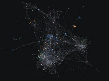
Data is the lifeblood of machine learning, but raw data is often a locked treasure chest. Data Visualization for Machine Learning is the key that unlocks this chest, transforming abstract numbers into intuitive visuals that guide every step of your project. It’s the difference between building a model in the dark and building one with a clear blueprint.
Mastering data visualization isn’t just a preliminary step; it’s a continuous practice that leads to more robust, accurate, and interpretable models. This comprehensive guide will show you exactly how to leverage visualization to achieve superior machine learning results, from your first glimpse of the data to explaining your final model’s decisions.
Read More about Top 5 Machine Learning Libraries Every Beginner Should Master in 2025
Why Visualization is Your Secret Weapon in ML
Before we dive into the “how,” let’s solidify the “why.” In the context of machine learning, visualization serves three critical purposes:
- Intuition and Understanding: The human brain processes visual information 60,000 times faster than text. Visuals help you grasp the underlying structure, patterns, and distributions of your data instantly.
- Hypothesis Testing and Problem Formulation: Is there a clear relationship between features? Is the problem linear or non-linear? Are there obvious clusters? Visualization helps you answer these questions before writing a single line of model code.
- Error Detection and Communication: Spotting outliers, data leaks, and biased sampling is dramatically easier with charts. Furthermore, visuals are the most powerful tool for communicating your findings and model behavior to stakeholders.
The ML Workflow: Where and What to Visualize

An effective ML pipeline is iterative, and visualization should be integrated at every major stage.
Stage 1: Exploratory Data Analysis (EDA) and Preprocessing
This is the most visualization-intensive phase. The goal is to get to know your data intimately.
1. Understanding Data Structure & Quality
- What to Visualize: Data types, missing values, and basic statistics.
- How to Visualize:
- Missingno Matrix: A brilliant library that provides a visual summary of data completeness. White lines instantly show you the pattern of missing data.
- Pandas Profiling / SweetViz: These tools generate interactive HTML reports that provide a comprehensive overview of your dataset, including distributions, correlations, and missing values, all without manual plotting.
2. Analyzing Univariate Distributions
- What to Visualize: The distribution of a single variable.
- How to Visualize:
- Histograms & KDE Plots: Perfect for understanding the spread, central tendency, and skewness of continuous numerical features. Is your data normally distributed, or is it skewed?
- Box Plots & Violin Plots: Essential for identifying the median, quartiles, and, crucially, outliers. Violin plots combine a box plot with a KDE, showing the full distribution.
- Bar Charts: The standard for visualizing categorical variables and class frequencies in your target variable. This is where you first check for class imbalance.
3. Exploring Bivariate Relationships
- What to Visualize: The relationship between two variables, often a feature and the target.
- How to Visualize:
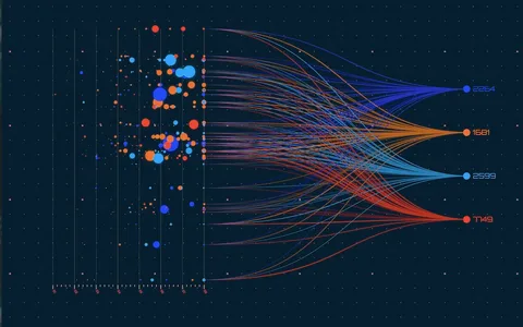
- Scatter Plots: The gold standard for seeing the relationship between two continuous variables. You can instantly see correlation, non-linear patterns, and clusters.
- Pair Plots (Scatterplot Matrices): A grid of scatter plots for all numerical variables in your dataset. It’s computationally heavy for large datasets but invaluable for smaller ones to get a global view of interactions.
- Correlation Heatmaps: A colored matrix that visually represents the correlation coefficients (e.g., Pearson) between all numerical variables. It quickly highlights highly correlated (and potentially redundant) features.
python
# Example Python code for a correlation heatmap using Seaborn
import seaborn as sns
import matplotlib.pyplot as plt

# Calculate correlation matrix
corr = df.corr()

# Create a heatmap
plt.figure(figsize=(10, 8))
sns.heatmap(corr, annot=True, cmap='coolwarm', fmt=".2f", linewidths=0.5)
plt.title('Feature Correlation Heatmap')
plt.show()
Stage 2: Feature Engineering and Selection
Visualization guides the creation and selection of powerful features.
- What to Visualize: Effectiveness of new features, relationships after transformation, feature importance.
- How to Visualize:
- Scatter Plots (again): Plot your new feature against the target. Does it show a clearer relationship than the original feature?
- PCA Visualization: If you’ve used PCA for dimensionality reduction, plot the first two or three principal components. Do the classes separate well in this new space? This validates the utility of your transformation.
- Feature Importance Bar Charts: After training a simple tree-based model (like Random Forest), plot the feature importances. This visually identifies which features the model finds most predictive.
Stage 3: Model Evaluation and Interpretation
Move beyond a single accuracy score. Visualize model performance to understand its real-world behavior.
1. Diagnosing Model Performance
- What to Visualize: How the model performs across different classes and probability thresholds.
- How to Visualize:
- Confusion Matrix: A must-plot for classification tasks. It shows you exactly where your model is confusing classes (e.g., predicting False Negatives vs. False Positives).
- ROC & Precision-Recall Curves: ROC curves show the trade-off between True Positive Rate and False Positive Rate. Precision-Recall curves are more informative for imbalanced datasets. The Area Under the Curve (AUC) provides a single powerful metric.
- Learning Curves: Plot the model’s training and validation performance against the number of training instances. This helps diagnose overfitting (gap between curves) and underfitting (both scores are low).
2. Interpreting Model Decisions (XAI)
Explainable AI (XAI) is crucial for trust and debugging.
- What to Visualize: How individual features contributed to a specific prediction.
- How to Visualize:
- SHAP (SHapley Additive exPlanations) Plots: The state-of-the-art for model interpretation.
- Summary Plot: Shows global feature importance and impact.
- Force Plot: Explains an individual prediction, showing how features pushed the model’s output from the base value to the final prediction.
- Partial Dependence Plots (PDPs): Show the relationship between a feature and the predicted outcome after marginalizing over the other features. Great for understanding the average effect of a feature.
- SHAP (SHapley Additive exPlanations) Plots: The state-of-the-art for model interpretation.
python
# Example code for a SHAP summary plot
import shap

# Explain the model's predictions using SHAP
explainer = shap.TreeExplainer(model)
shap_values = explainer.shap_values(X_test)

# Plot the summary
shap.summary_plot(shap_values, X_test)
Common Pitfalls and Best Practices
- The “Pretty Picture” Trap: Never prioritize aesthetics over truth. A misleading chart is worse than no chart. Always label axes, provide context, and choose appropriate scales.
- Over-plotting: When using scatter plots with thousands of points, they can become a blob. Use transparency (
alpha), 2D histograms (hexbin), or sampling to mitigate this. - Ignoring the Business Context: A correlation might be statistically significant but meaningless in the real world. Always tie your visual insights back to the domain problem.
- Tool of Choice: Python libraries like Matplotlib, Seaborn, Plotly (for interactivity), and Pandas (built-in plotting) are the industry standard. For quick analysis, tools like Tableau or Power BI can also be highly effective.
Conclusion: Visualize to Actualize
Data Visualization for Machine Learning is not a mere optional skill; it is a core competency for any successful data scientist or ML engineer. It bridges the gap between human intuition and computational power, enabling you to build models that are not just accurate but also understandable and reliable.
By systematically integrating the techniques outlined in this guide—from EDA with histograms and heatmaps to model interpretation with SHAP plots—you will make more informed decisions at every turn. You will build better features, select more appropriate models, and ultimately, deliver better machine learning results that you can confidently explain and stand behind.
Stop treating your data as a black box. Start visualizing it, and watch your model’s performance soar.

GIPHY App Key not set. Please check settings